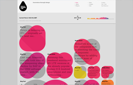
Method Design Lab’s tagline is “Innovation through design”, and they claim to be the “first accelerator to take a design-centric, user experience driven approach to innovation.”
As an organization that talks about user experience being something that differentiates, they appear to be taking that approach to their homepage. First, you are greeted with a Tetris-style animation of series of block-like things quickly dropping in. Each ‘block’ is a different size and has a different color and contains some text. It took probably 20-30 seconds for the whole thing to load. The whole thing looks kinda cool, it’s clean and minimal with large type, but I just wasn’t sure what I was looking at. It turns out its an aggregated feed of technology links from around the web. They’re organized by color, each of which corresponds to a different hour of the day, and it progressively loads all articles hour by hour. So the later in the day you visit the site, the longer it takes to load. I’m not sure this part was well thought out since loading a whole day takes quite a while. Perhaps it should buffer and only show a few recent hours to prevent a firehose? I’m also not sure what is meant by the different size blocks, since they all seem to be presenting similar info. It may be more aesthetically pleasing, but has no obvious meaning, so I’m not sure what the point is. And when you click on an article, you get a little popup, with maybe only slightly more information than the box (or not) and a link to read the article. And if it’s a tweet, for some reason it strips out links, leaving a bit of text with no context. One last thing that really makes it annoying to use is that if you navigate back to the home page, it reloads the whole thing, going through the whole Tetris thing again.
I realize that Method is probably treating this as an experiment of sorts, just an idea or something fun. And as that it’s totally fine, and I understand that their core mission is not feed aggregation. But I think a better use of their home page would be a clear introduction to what they actually do instead of a gimmicky thing that’s not really useful.


I think its important to try and create new experiences for users and I think this site’s homepage is designed to be an artful visual experience as opposed to a place for rapid consumption of recent articles. It still serves as a place to get news but to me, the visual experience is the most rewarding part of it.
I love to see designers go out on a limb. It takes courage to implement unproven design patterns.
love it
nice, clean and refreshing. i would drink it if i could.
and the time nav UI is really slick. all kudos from me.
“Method Design Lab is the first accelerator to take a design-centric, user experience driven approach to innovation.”
Blablabla – that’s an empty marketing phrase for me that says nothing other than “We try to sound hip by using a few very general buzzwords.”
Yeah, they are a *design* lab with special focus on the design of unusual/unexpected functions. If that’s what this website is trying to sell then OK but they are certainly not winning the usability award.