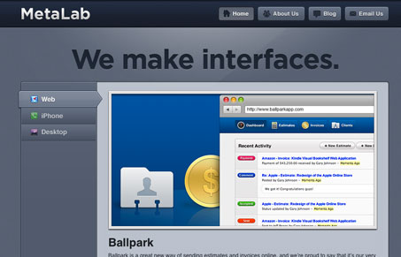
I pretty much love everything metalab puts out, their recent redesign had me of course pouring over all the details. This site doesn’t let me down. It’s totally different from what I would expect from these guys. It’s far more scaled back in content than I would like as well, I don’t know if that is coming from me as a designer who likes their work or me thinking about the site from the perspective as a possible client. I’m not as excited about the visual feel of the site, I honestly think it has the feeling of something from a few years ago, however i’m not sure that’s such a bad thing. In a way I kind of like that, knowing that I sound hypocritical there.
I really like the fact that the home page is basically a big portfolio carousel. You can sort out the work by their three competencies, then cycle through work samples. The about us page is simply gorgeous, it has everything you need to know and it does it with style. I know I want to read more, but I really don’t have to. The blog is also very well done, there are some great details on the blog even though it feels supremely simple.


I don’t think this screenshot does the site any justice. Make sure and go visit the site before passing judgment. It really does have a great feel to it.
Like it. Although somehow it’s kind of remind me of Atebits.com design.