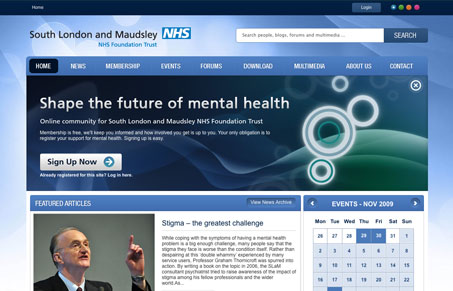
I think there are a lot of nice looking pieces to this design that make the whole of the design work. I like the navigation design, and many of the “news box” areas, particularly the newsletter and poll boxes. I’m not sure about the color changer in the top right, it’s nifty but pointless and overall it looks like the elements were designed separately and then pushed together. Overall I think the design is just fine but better cohesion between the elements would go a long way to making this a great website.
Looking Fast: The Art of Website Speed Perception
In the web world, technical speed and user perception matter. By improving design for a faster appearance, you boost conversions and stand out online. Speed isn’t just loading time; it’s perception.


0 Comments