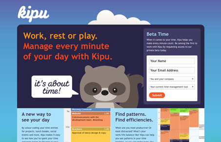
I love the feel of this website, the illustrations/mascot is a nice idea here. Bringing a since of fun and joy to the layout of your web app site can really work in your favor. It can put users in a good frame of mind while working with your app too.
Design wise I love this site, the big chunky areas and type mix really well with the illustration style. The background execution is also really cool with the bottom part staying static and the top background section (the sky) moving like it does. Really cute and clever site.
I also can’t wait to check out their app because of it!


Very cute site, colors are great and logo typography fits the overall “feel” of the site. Couple issues: needs more white-space in the copy. Information and images seem to take over the middle 1/3 of the site and gets a bit cramped. Secondly, no HTML5?
but the issues are almost moot when seeing how cute the little mascot is.
I’d have to agree with you Isaac. The thing about this site too is it looks like a placeholder/temporary site for when the product is finished, that’s a great bunch of work for a temp site i’d say!
Check the blog out, it’s looking pretty good too.