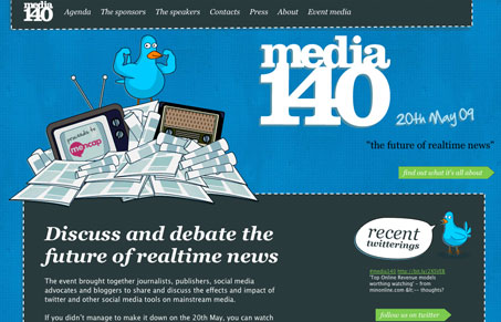
You gotta love a twitter bird on steroids… I really like the blue background of this website, the texture/pattern gives it what it would otherwise be lacking. I also like the transition from the blue to the white background with the pattern. The illustrations are clever and gives it a nice sense of hand-crafted-ness (I know that’s not a word.) The footer starts to lose me, in that I don’t think it’s executed as well as the rest of the page. Overall though, this is a pretty good conference website.
Looking Fast: The Art of Website Speed Perception
In the web world, technical speed and user perception matter. By improving design for a faster appearance, you boost conversions and stand out online. Speed isn’t just loading time; it’s perception.


I really really like this site – but it must be wider than 960px. It gives me a horizontal scroll bar on my old secondary laptop.
@Ryan – not sure man, doesn’t seem to do that for me. Could be a specific browser thing? Would be cool to know what browser you’re running.