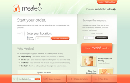
I really like the unique color scheme on this site. The mint green and orange combo are relaxing and even appetizing – maybe because it kind of reminds me of sorbet. The orange works really well guiding my eyes through the content to certain areas of attention. It’s interesting that the orange is the only thing that is use to direct people through the site seeing as how there is no traditional navigation backing it up. I’d like to know what more people think about that if you could leave a comment.
The toolbar at the bottom may be superfluous but it reinforces the easy steps and maybe encourages the user to go through them. These guys also did a great job with the “How To” video. This site personifies want an everyday person wants in a web app because it’s pleasing to look at and use and conveys large amounts of information simply. I really enjoyed the part of their video where they showed off the search options inside restaurant menus. Now if only this worked for South Carolina!


0 Comments