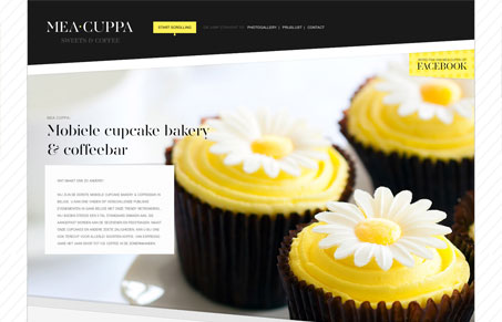
It’s a one-page, parallax, responsive website for a mobile bakery and coffeebar. ( so be sure to scroll and resize your browser )
Submitted by: @chilli_be
Role: Designer & Developer
This site has a lot of style. The way the photos, colors and type create contrast works really well. The colors are bold and the photos are vibrant and inviting. This is also a good example of how adding some angles can help draw the eye down the page. The large headline font is a bit hard to read, although it’s a really good choice for this design.
I really like that the parallax behavior is very subtle, for the most part the sections fade in and out as you scroll down. It’s very effective. Also, the execution of the responsive behavior is really smooth. There are no awkward breakpoints or other weirdness, it looks intentional at any size.


0 Comments