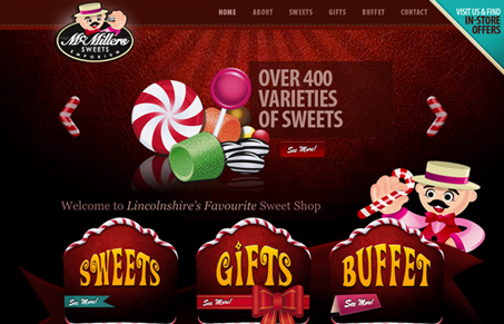
This site is visually out-of-control, in such a good way it makes my eyes hurt. I love this design. Specifically I love the illustration work. It make me want to find out what a “sweets buffet” is in person. Good work on this site!
Glassmorphism: The Transparent Design Trend That Refuses to Fade
Glassmorphism brings transparency, depth, and light back into modern UI. Learn how this “frosted glass” design trend enhances hierarchy, focus, and atmosphere, plus how to implement it in CSS responsibly.


The tone of this site is perfect. The illustrations capture the whimsy and joy of being surrounded by candy. The font they’ve chosen for the ‘Sweets’, ‘Gifts’, and ‘Buffet’ is perfect in this scenario and a good example of how the subject matter can allow you to use a font that may be inappropriate 99.9%of the time.