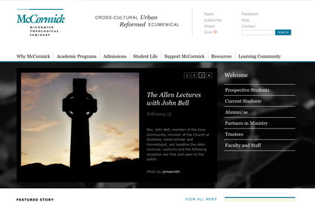
I think this website has somewhat of a corporate undertone, with the use of blue and black and the clean tight lines/grid. It his quite well organized and really easy to get to what your seeking for. I quite like the design, it’s a nice blend of using whitespace as well as you can and sticking with a nice solid grid, especially in the header and footer areas.
Glassmorphism: The Transparent Design Trend That Refuses to Fade
Glassmorphism brings transparency, depth, and light back into modern UI. Learn how this “frosted glass” design trend enhances hierarchy, focus, and atmosphere, plus how to implement it in CSS responsibly.


0 Comments