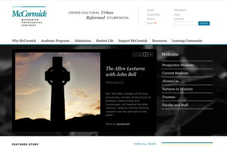
I think this website has somewhat of a corporate undertone, with the use of blue and black and the clean tight lines/grid. It his quite well organized and really easy to get to what your seeking for. I quite like the design, it’s a nice blend of using whitespace as well as you can and sticking with a nice solid grid, especially in the header and footer areas.
Looking Fast: The Art of Website Speed Perception
In the web world, technical speed and user perception matter. By improving design for a faster appearance, you boost conversions and stand out online. Speed isn’t just loading time; it’s perception.


0 Comments