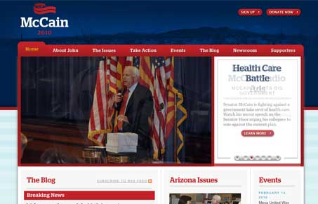
This is probably one of the best website designs i’ve seen for a political candidate. First here is that the branding is really well done, the McCain logo is top-notch. That sets the foundation to build on for the website, things could have gone downhill fast from there, but the Forty Agency delivered a really great experience with this website. You can also check out the site’s welcome post about the re-launch.
Forty has a great blog post with pictures that detail the process. Technically they post that:
The entire site was built in HTML 5, the next major revision of HTML, and implemented in the Expression Engine content management system.
The design has a nice balance of clean, open space and imagery. The colors are of course red, white & blue but what do you expect? There are some nice things happening when it comes to fine detail work on this site too, like down in bottom area of the site and the far right 3rd column. The typography gives it a nice soft feel too, something McCain’s brand might need more of, so that’s a great direction to take the design in. It’s neat to see the main focus of the site’s content be centered around the blog posts, that may be standard fare for political sites these days but it is a departure from tradition in this field of websites.
The thing about political candidate websites for me is that I love to see how different designers handle the struggle with visual hierarchy from section to section (specifically talking about home pages for political sites.) This one has the same issues as say Obama’s presidential election site did (or any large news site for that matter, like CNN.com or something), wherein you have all this content that you need to get onto the page and normally have a set of big honkin’ pictures you need to place high up on the page physically, just like with this one. I think the McCain site handles the hierarchy of information pretty well. This site is also another great example to use when you need to explain to a client that a scrolling website isn’t the devil.
The thing I like most about this website is it’s content architecture. Go through the site one good time and you’ll notice there’s not a straight up sub navigation, the content is all integrated into the flow/experience of using the website. You don’t even miss the sub nav. I mean they have navigation elements on pages where it’s needed, when it’s needed but overall you just feel like you “flow” through the content naturally. And that’s not easy to achieve.
I also have a note from Sunny Thaper at Forty Agency about the project:
Just a quick note that the entire effort was not just Forty, but a couple of companies. If it’s cool, I’d like to list them out real quick (also note, all these are local AZ companies):
Ovo: brandsbyovo.com
Deru: deru.net
Sorenson Media: sorensonmedia.com
ExpressionEngine: expressionengine.com (CMS)
DevFu: devfu.com (helped with the home page rotator)And a quick shout-out to Corey Vale and Jeremy Vaught from the McCain headquarters for working very closely with us and keeping an open mind about what is possible in the political campaign space.
Kudos on a great site design.


Once again, thanks for an awesome review! It is very much appreciated. We are hoping to expand upon our efforts and bring even more to this site in comming months as well.
Side note, it’s “Forty” not “40.”
I’m glad you appreciate the post Sunny! I really enjoyed reviewing the McCain site, it’s a thing of beauty.
Sorry about the “40” vs. “Forty” too, the post has now been updated to reflect that. Hope I didn’t offend too much.
Gene, it would take more than that to offend us 😉 Thanks a bunch for the great review!
I think that running and losing to obama was the best thing that could have happened for McCain’s interactive political life. Kind of kicked him in the ass and made him realize this isn’t 1880 anymore. You have to have AND manage your brand successfully online, then extend it out through the other mediums.
You guys may see a little more traffic today. 🙂 We just posted the review on the Facebook page. Keep up the great work. Thanks.
Corey Vale
Internet Director
McCain 2010
Thanks Corey!
What happened to the nice site? Right now, there’s a plain uninspiring black, white, and grey one up there.
Gene,
Thanks for the glowing review. We are happy to see the brand, and website being accepted by the community–even if their not “supporters.”
Cheers,
Kyle Hildebrant
OVO
their = they’re 😉
Certainly far better than his presidential site. They really need to do a bit of lightening in Photoshop on his teeth though…
@Kyle – Great design will always trump partisan affiliations when it comes to giving credit where it’s deserved. Great work on that branding work too.
@Ashley – It sure seems that way doesn’t it?