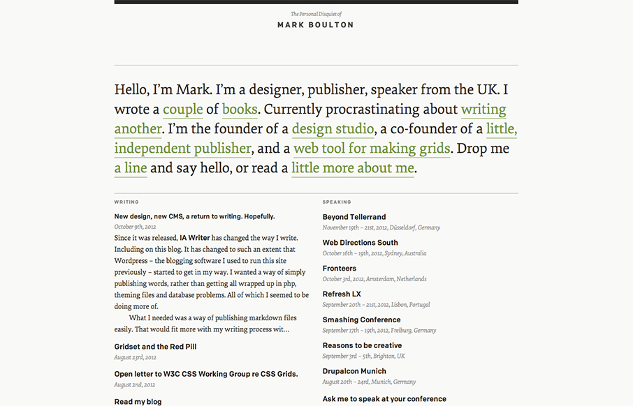
Mark Boulton

http://markboulton.co.uk/

I’ve watched Mark Boulton’s blog/site designs over the years make this really refreshing trip towards being completely minimal. I love it. He’s gotten down the just the bare essence of what he needs in a website, particularly with this latest design iteration.

Mark sums up his decisions rather succinctly in his blog post on the subject of this design.

This new design is a return to a design I ditched a little while ago. Single column. Sized to be easy on the eye. There’s a bit of Gridset in there to create the grid. Type from Process type – specifically, the serif is the rather lovely Elena and the sans serif is Colfax.

0 Comments

Submit a Comment

Your email address will not be published. Required fields are marked *

News & Articles

Looking Fast: The Art of Website Speed Perception

Looking Fast: The Art of Website Speed Perception

In the web world, technical speed and user perception matter. By improving design for a faster appearance, you boost conversions and stand out online. Speed isn’t just loading time; it’s perception.

Designing for Errors: Creating User-Friendly Contingency Plans

Designing for Errors: Creating User-Friendly Contingency Plans

Contingency Design hinges on empathy, understanding user frustration, and transforming errors into positive impressions. By embracing these principles, you enhance user experiences, retain customers, and boost revenue in the competitive digital landscap