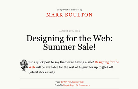
The newly re-designed personal site for Mark Boulton. This is a really scaled back blog for what looks like his personal writings and experiments, I love it. I love the simplicity and almost perfect cleanliness to it. I love that it’s all set it Georgia and even though it’s rather simplified (to which Mark is definitely not) it really gives you a sense for his personality. The reds in contrast with the overall black text really stand out and give certain elements/links punch. I think the design really stands in stark contrast to a lot of what you see on the web at large. Great work Mark!
Glassmorphism: The Transparent Design Trend That Refuses to Fade
Glassmorphism brings transparency, depth, and light back into modern UI. Learn how this “frosted glass” design trend enhances hierarchy, focus, and atmosphere, plus how to implement it in CSS responsibly.


0 Comments