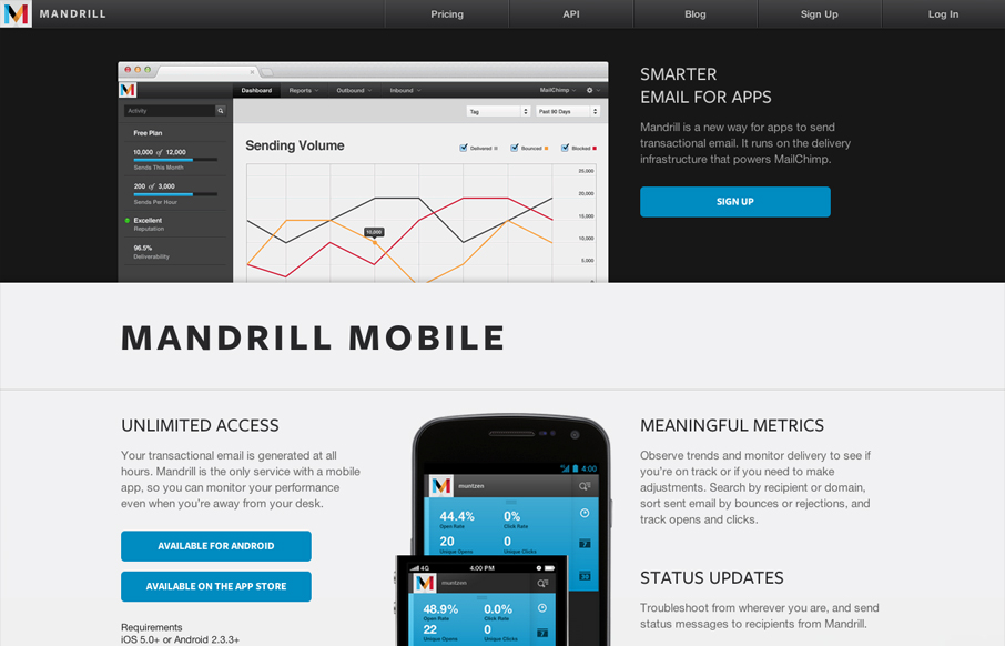
The Mandrill site is a such a nice product/app website. The experience is clean with a few little visual treats here and there, like the slight parallax type image shift on the two mobile phone images. Good responsive design too. I particularly like the signup form experience, it all takes place there on the home page, they keep it super simple and it’s one form fade in and your done.


Glassmorphism: The Transparent Design Trend That Refuses to Fade
Glassmorphism brings transparency, depth, and light back into modern UI. Learn how this “frosted glass” design trend enhances hierarchy, focus, and atmosphere, plus how to implement it in CSS responsibly.


I agree that the sign up experience is super nice, but with one exception. The signup button at the bottom of the page causes the page to scroll to the top where then the form exists new. I feel like that’s a bit of a disruption when you consider the clean aesthetic and graceful interactions of the site otherwise.
Good point Maria. That interaction does seem a little awkward after scrolling around and stuff and coming back to it like you say.