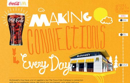
So I’m definitely not the target for this site, and I can safely say that probably 100% of people reading this aren’t either. The whole point of this is for Coca-cola to tell McDonald’s and their franchise owners that ‘Hey, we’re awesome! We love you guys! Please don’t leave us for Pepsi!’. And they say it in such flowery language: “The Coca-Cola Company helped McDonald’s to execute a three-pronged strategy for orange juice raw material pricing that delivered $4 million in savings.” and “To make sure consumers in each local market have the Sparkling and other beverages they prefer, we invested significant resources in a Brand Optimization initiative for McDonald’s restaurants.” That all sounds like dry, boring bullshit persuasive, informative copy. Which is to say that it’s if you’re going to try to get that kind of information across it’s probably best to package it up in something fancy that’s going to make the user feel something, since the words aren’t really going to do it. And lo and behold the site is really nice! The illustrations are fun and the colors are punchy. It’s fun to scroll down and see the parallax action. It’s almost like Coke knows what they’re doing.
Glassmorphism: The Transparent Design Trend That Refuses to Fade
Glassmorphism brings transparency, depth, and light back into modern UI. Learn how this “frosted glass” design trend enhances hierarchy, focus, and atmosphere, plus how to implement it in CSS responsibly.


Jay, You seem to have something against the content of this site. I’ve seen this site as more of a gallery for design and not a place to go anti-corporate or political about content on designs.
I think this design is great and one of the best parallax sites I’ve seen around! (If a bit of a heavy footprint).