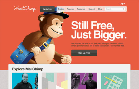
Check out the latest iteration of the MailChimp website. I really like how it’s largely static, the main graphic that gets featured is the main story they want you to see. It could have been easily made into some sort of slide show, hurrah for holding back a little. The colors are bold and really make the page have a rich feel. Another thing I like is how it starts out simple and focused and as you scroll down the page the content and amount of items increases, sort of a gradient of content…
I also love the sub page designs, the multi columns on the secondary page really help put focus on all the great imagery and personality this company has. The plans and pricing page is as complicated as ever for an email marketing application site, but it’s really a lot of information to communicate and I like the solution they’ve employed here.
I especially love this new version of the MailChimp.com website. Jay and I discuss it some more detail in our screen cast review.


0 Comments