Mailchimp

http://mailchimp.com/

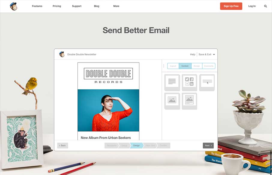
The new Mailchimp site is superb to say the least. The simplified layout on the homepage really sets the tone for the rest of the design. Incorporating the video of how the app works into the homepage like this is smart and works very seamlessly, you almost don’t even realize what it is at first. I also love the way the nav switches its alignment as you make the site slimmer for different screen widths.

This is also super subtle but they reworked the Mailchimp text for the logo too. Jessica Hische was enlisted for the up-fitting and she has a great little post about the work too.

2 Comments

  1. Shaimoom Newaz

    They are like my go to for inspiration whenever I can’t seem to get clean enough.

    Reply
    • UnmatchedStyle

      Agreed!

      Reply

Submit a Comment

Your email address will not be published. Required fields are marked *

News & Articles

Looking Fast: The Art of Website Speed Perception

Looking Fast: The Art of Website Speed Perception

In the web world, technical speed and user perception matter. By improving design for a faster appearance, you boost conversions and stand out online. Speed isn’t just loading time; it’s perception.

Designing for Errors: Creating User-Friendly Contingency Plans

Designing for Errors: Creating User-Friendly Contingency Plans

Contingency Design hinges on empathy, understanding user frustration, and transforming errors into positive impressions. By embracing these principles, you enhance user experiences, retain customers, and boost revenue in the competitive digital landscap