madeinhaus.com

madeinhauscom

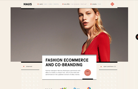
I really dig the home page of this site, I love the big image and the way the slideshow is executed. Really nice minimal feel and the way the tool tip image folds out on top of the client logos is really nice.

I do think however that some of the sub pages lack the home page’s impact, largely because of the size of the content in relation to the header navigation design. I lose the scale from the home page and that’s what made it look so great to me.

0 Comments

Submit a Comment

Your email address will not be published. Required fields are marked *

Time limit exceeded. Please complete the captcha once again.

News & Articles

Website Scanning Patterns for Maximum Engagement

Website Scanning Patterns for Maximum Engagement

Discover how users visually process websites, the role of scanning patterns, content placement, and “the fold” Learn to design engaging pages with fast-to-consume content that aligns with user behavior.