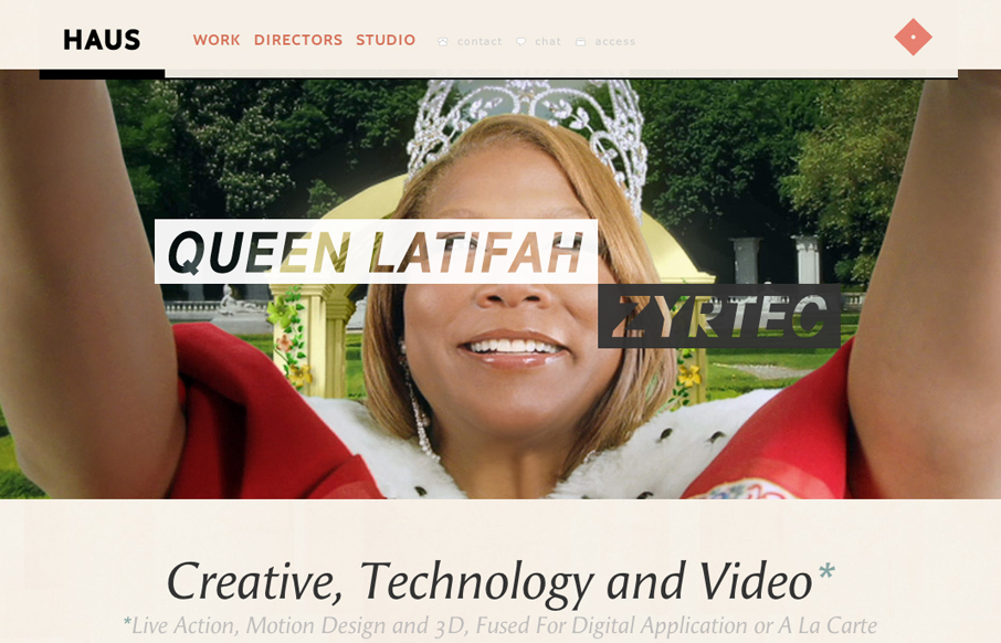
I immediately love the content hierarchy on the home page, the shapes and spacing of the content groupings really let it ease into your view. The fixed header is a nice touch, especially the slight transparency as you scroll. Really loving the circle images and the blocks of copy used like they are throughout the site. It gets better with the subpages too, check it out in detail and let us know what you think too.
Glassmorphism: The Transparent Design Trend That Refuses to Fade
Glassmorphism brings transparency, depth, and light back into modern UI. Learn how this “frosted glass” design trend enhances hierarchy, focus, and atmosphere, plus how to implement it in CSS responsibly.


0 Comments