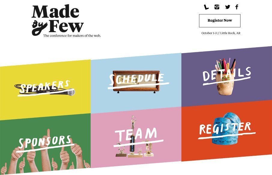
Beautiful website for the Made By Few conference! It’s always a good looking site, but this year they’ve taken it up a notch. I love the hand made elements worked into a solid grid layout like this. All the way to the footer this thing is full of nice details and little well timed interactions. Good work!


The Call to Action, Revisited
The Call to Action hasn’t changed in a decade, but the bar has. A fresh look at prominence, copy, mobile tap targets, and accessibility, with lessons from three major design systems.


0 Comments