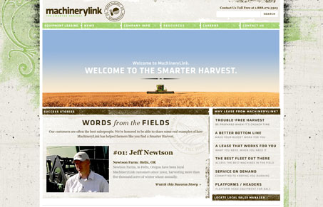
Really nice worn out look, the textures and line work is done really well. There are some nice little details across the site too. Like the image boxes and the frayed edges around the main box areas. I think the navigation placement is hap hazard though, it’s nice looking enough but the top horizontal design is a bit understated for the sub pages and the side navigation items aren’t consistent enough. Nice looking site in general though.


0 Comments