Lynn Cyr

lynncyrcom

Submitted by Lynn Cyr, @LynnCyrArtist. Designer.

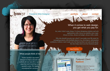
I usually love sites that have a real hand-drawn, rough and sketchy feel, this one has that but it doesn’t quite go all the way. I like the large photo of Lynn, and it achieves the most important part of any personal portfolio, which is to allow the user to get a sense for who the person is. The pictures also really help sell this. This is a good looking site for sure, I think more depth and sharpness in the way the brushes are used would push this site over into great territory.

0 Comments

Submit a Comment

Your email address will not be published. Required fields are marked *

News & Articles

Sign-Up: Enhancing Conversions through good UX

Sign-Up: Enhancing Conversions through good UX

Optimize your website’s sign-up process by focusing on clarity, ease, and user mindset. Clearly explain the purpose, benefits, and steps, and use social proof to build trust and drive conversions.

The Essential Guide to Getting Started on Freelance Writing

The Essential Guide to Getting Started on Freelance Writing

Explore the lucrative and fulfilling world of freelance writing with our essential guide. Learn about specialties like blogging, social media, article, and technical writing. Build a portfolio, find work, set up your business, and discover the potential earnings. Embrace the freedom of working from home and follow tips for success in your dream career.