Lounge Lizard

http://www.loungelizard.com/

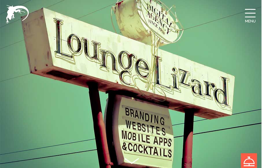
I’m glad Lounge Lizard out of NY and LA submitted their website to us. There’s a little bit of Don Draper in all of us (hopefully the good parts) – and that’s projected in LL’s website, along with good modern design. Like the block design in the subpages and the movement of the slideshow in the About page. And if you know me by now – love love love the call to action of the bellhop bell as a sticky footer – then more overt when you scroll to to bottom.

From the Designer: “The new Lounge Lizard Website showcases our agencies Website and mobile APP design portfolio. We combined modern clean responsive design with retro images that capture the companies culture.”

Submitted by: Ken Braun
Role: Designer
Country: USA

0 Comments

Submit a Comment

Your email address will not be published. Required fields are marked *

News & Articles

Sign-Up: Enhancing Conversions through good UX

Sign-Up: Enhancing Conversions through good UX

Optimize your website’s sign-up process by focusing on clarity, ease, and user mindset. Clearly explain the purpose, benefits, and steps, and use social proof to build trust and drive conversions.

The Essential Guide to Getting Started on Freelance Writing

The Essential Guide to Getting Started on Freelance Writing

Explore the lucrative and fulfilling world of freelance writing with our essential guide. Learn about specialties like blogging, social media, article, and technical writing. Build a portfolio, find work, set up your business, and discover the potential earnings. Embrace the freedom of working from home and follow tips for success in your dream career.