
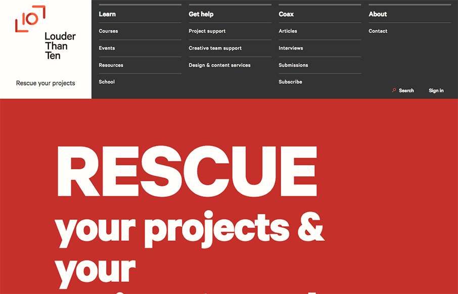
Louder than Ten, the digital home of Rachel and Travis Gertz, is a wonderfully designed approach to a digital services company website. I love the thoughtfully placed main navigation, including it’s transformation on smaller screen widths, and the large and easy use of the space in the browser. This site takes full advantage of the medium, we can all take lessons form this site design. I know I will.


Fitts’s Law: Why the Easy Button Wins
Large, close targets are faster to hit than small, distant ones, that’s Fitts’s Law. A look at the 1954 rule behind buttons, prime and magic pixels, thumb zones, and dark patterns.


0 Comments