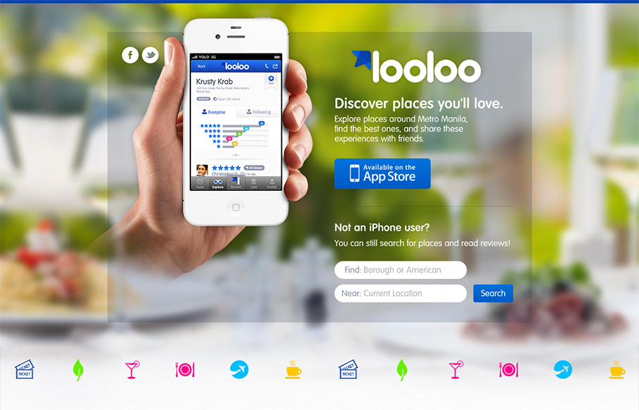
Pretty solid iPhone app site. It’s pretty much just a single page design, you can search but generally it looks like an internal app page to me. Overall it is a solid design with some really nicely worked icon design. The overall design seems to fit into the app design pretty well which is good generally speaking. I would love to see more of the app on the page to help sell me on what it’s like to use it, then again maybe it’s not needed. I like the big call to action with the app store button front and center too.


The Call to Action, Revisited
The Call to Action hasn’t changed in a decade, but the bar has. A fresh look at prominence, copy, mobile tap targets, and accessibility, with lessons from three major design systems.


0 Comments