Submitted by Christopher Leckie @leckie.
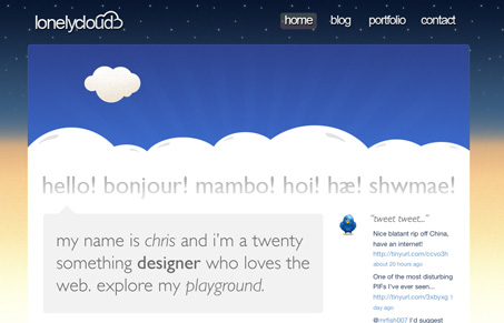
This is an interesting site. It has some really nice elements like the logo and the hand made illustrations. The blog link doesn’t work so I was bummed there, but the portfolio and contact form pages are quite nice.


Am I the only one who’s getting tired of these gigantic “Hi, my name is blank”? This perfectly illustrates my frustration. You don’t even see any content until you’re below the fold. The design itself isn’t that strong either. There seems to be nothing really connecting the background with the cartoony clouds in the header.
@john
Yeah, it does look kind of hastily pulled together. I really wanted to read the blog. I am getting tired of it too, I like to have some context for the images used vs. the content.
It would also be cool if the background changed out depending on the time of day you visited the site. That’d be neat, and add some context for the large images used.