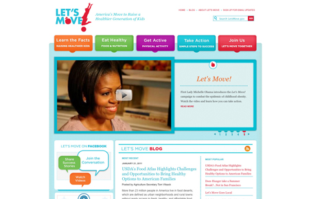
The Let’s Move website is a really nice mix of detail work and generality. I think the design is open in the sense that anyone can relate to it. It’s youthful without employing comic sans, it’s colorful without going too far off the deep end with color, it’s got some nice interface details in enough places to be useful and engaging. The content is also delivered well. It’s not verbose and it’s visually oriented with nice imagery and graphics.
With any kind of public campaign like this there’s always going to be multiple points they want to inform you on and from my experience the call to action on sites like this is usually lost pretty quickly. With this site being mainly to inform and get you to act/be active the to horizontal section that would normally be reserved for standard navigation is sort of amped up and each main point is made to look like a call to action badge/button. Yes, it’s still navigation basically but it looks more like discreet calls to action to me. That’s probably the smartest part of the layout.


I love when kids get healthy.Its so fun when you believe.