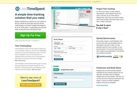
I was really happy when I came across this web app site. It’s different than the typical big screenshot with 3 featured content sections along the bottom formula sites. I really like the feel of this home page and the first screenshot with the arrow that tells you how to “start and stop a timer” is so simple and smart. The sign up page is really straight forward too and I like the option to log in with your gmail account as well, I don’t think i’ve seen something like that before either.
Glassmorphism: The Transparent Design Trend That Refuses to Fade
Glassmorphism brings transparency, depth, and light back into modern UI. Learn how this “frosted glass” design trend enhances hierarchy, focus, and atmosphere, plus how to implement it in CSS responsibly.


Thanks for the feature! Check out the design process for this site here: http://55eleven.com/blog/2009/08/lesstimespent-design-process/
That’s a great write up Josh, really enjoyed looking into the process behind the redesign. Thanks for sharing.