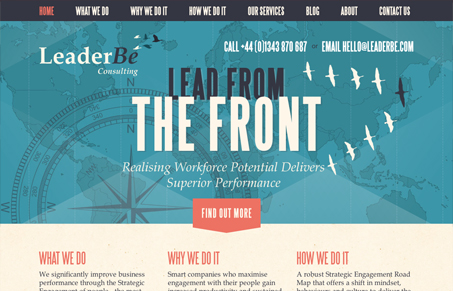
I love the cohesive design this site has powering it’s message. The visuals all speak to the copy and the mood. I really love the big mountain range illustration that props up the footer too. I think the sub pages in general could use some more love since the overall design is so visually rich it feels like a let down to discover they are largely the same treatment. However sometimes that’s just fine for general purpose and in the end here the website looks pretty dang good.


0 Comments