
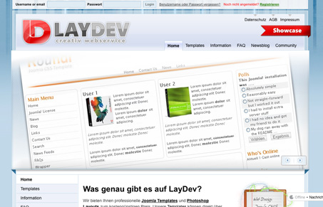
I really like the super huge images used in this design, the colors are also really cool feeling and hot colors like red and orange are used at interaction points really smartly. The simple well placed 3D styled elements make certain featured links and parts stick out and really obvious.




0 Comments