lauraburciaga.com

lauraburciagacom

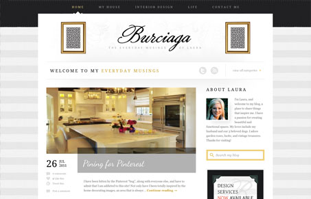
Very nice upscale looking design for this blog. I like how it really sells visually the tone of what this person does. She’s an interior designer, you just get that immediately from the visual design alone. It’s a decent blog content wise too if you’re into this stuff.

2 Comments

  1. Jay Barry

    The script font on the blog posts is a perfect choice for this site. It provides a good contrast to the very structured nature of the blog and blog posts.

    I do feel that the framed designs in the header are distracting, perhaps they have some special meaning but I just don’t see why they’re there. It would also be nice to have some sort of different editorial design for each type of post (House/Interior Design/Life). The site has so much content it would help to separate these areas visually.

    Reply
  2. Gene Crawford

    I know what you mean, I thought those framed images were QR codes at first.

    Reply

Submit a Comment

Your email address will not be published. Required fields are marked *

News & Articles

Looking Fast: The Art of Website Speed Perception

Looking Fast: The Art of Website Speed Perception

In the web world, technical speed and user perception matter. By improving design for a faster appearance, you boost conversions and stand out online. Speed isn’t just loading time; it’s perception.

Designing for Errors: Creating User-Friendly Contingency Plans

Designing for Errors: Creating User-Friendly Contingency Plans

Contingency Design hinges on empathy, understanding user frustration, and transforming errors into positive impressions. By embracing these principles, you enhance user experiences, retain customers, and boost revenue in the competitive digital landscap