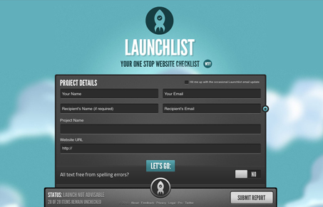
I love launchlist, I love the idea and the execution is great. Aside from the idea being great – the design of this site is wonderful. It’s a single page web app but there’s a lot going on here. The fixed footer/bar, the animated clouds in the background and the the way a lot of the little form interactions are done are top notch in my opinion. This is a great example of doing something that’s extremely fun and mixing it with something we all need. Great stuff!
Glassmorphism: The Transparent Design Trend That Refuses to Fade
Glassmorphism brings transparency, depth, and light back into modern UI. Learn how this “frosted glass” design trend enhances hierarchy, focus, and atmosphere, plus how to implement it in CSS responsibly.


Launchlist is amazing. From the UX to the logo (especially the logo) Launchlist is a well crafted site and concept. Going to use it on my next project.
I agree. Their logo is near perfect and I want to eat their interface.