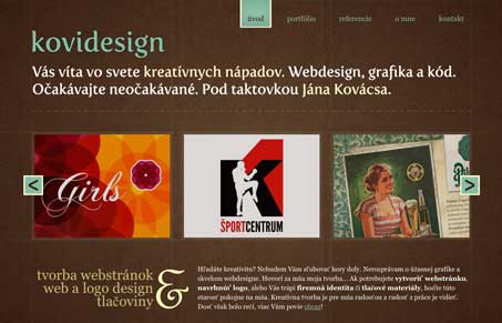
I love the soft feel of this design with the hard grid backed up by the gridlines in the background image. The colors are also really nice too. The type is also handled nicely, especially below the three main images in the slideshow. I do feel like the navigation isn’t as strong as it could be, but it does work well within the confines of this design, I say that without any real constructive feedback other than my gut feeling so take that as you will. Overall though, I do like the way this site is put together visually, really nice.
Glassmorphism: The Transparent Design Trend That Refuses to Fade
Glassmorphism brings transparency, depth, and light back into modern UI. Learn how this “frosted glass” design trend enhances hierarchy, focus, and atmosphere, plus how to implement it in CSS responsibly.


0 Comments