
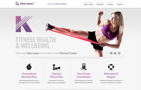
I kind of dig this single page site design. It’s really not enough content to warrant a full site, so the single page design really works perfectly. I like the different content sections and how they really break up the flow of the page yet all scan easily as you read down the page. The icons are a really nice touch as well as the training packages design, smart both business wise and design wise. Great looking site.




0 Comments