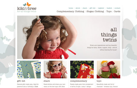
Very nice layout with this site. I love the branding here, and the use of the butterflies in the background really echos that to the fullest. The colors and typography are perfectly executed. What would make this site perfect is to have the navigation and other main text areas be active text instead of images, that’s a technical thing and not purely design related though, but I think it would go a long way.
Microinteractions
Microinteractions are subtle site animations enhancing engagement. They include triggers, rules, feedback, and sometimes loops/modes. Practical uses: improving engagement, guiding user behavior. Well-designed microinteractions boost user engagement and your online presence.


I agree that the colours, imagery, and typogragphy create a really gentle and upscale feel. Besides text-based navigation, the site should have some indicators on the page to let you know where you are within the site.
I think that the site could do more to emphasize that the site specializes in clothing for twin kids, though. Photos of actual twins and identical-sized butterflies in the logo would make things more obvious to people like me who are too lazy to read and won’t notice the tagline or main heading.
Great site – love the colours and clean layout.