
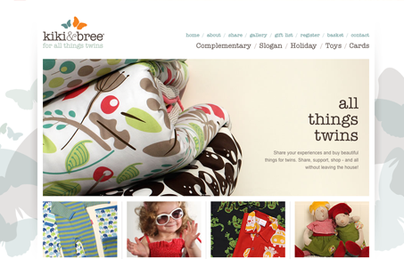
Kiki & Bree is a twin apparel website, that alone is an interesting concept for a business. The design of the site is pretty straight-forward, I like the photography it’s what really sells the website for me. It’s clean and crisp photography that was clearly well directed. I love the colors in the branding and the background imagery helps make the overly rigid design feel softer. It’s just a nice simple mix of the soft and hard edge feel that gives it the visual contrast that I like.




Hasn’t this site already been featured? Oh well. It’s worth re-posting because it’s been an inspiration for a while. The photos really are top-notch and I also like cool pastels in the background.
Ugh, you’re right Tim! Didn’t catch that since it was a draft as well as a previously posted article.
I’ll try and be better at making sure of no re-posts. I’m glad we have people like you reading UMS to keep us straight.