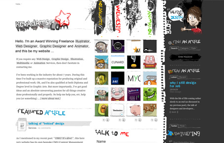
Great looking illustrator blog for Kev Adamson. I love the illustrated elements carried throughout every corner of this site, that’s awesome. I’m a little concerned for the top navigation elements being in a hand made font and turned on their site, they are really difficult to read but that’s really all I see that may be tough for people to figure out. This site is otherwise superb. I really love the little twitter bird icon.
Glassmorphism: The Transparent Design Trend That Refuses to Fade
Glassmorphism brings transparency, depth, and light back into modern UI. Learn how this “frosted glass” design trend enhances hierarchy, focus, and atmosphere, plus how to implement it in CSS responsibly.


Awesome video review, now thats something you don’t see every day.
I agree with your point about the top navigation but besides its a really appealing site
Thanks for the feature and I *love* the idea of video reviews – that’s the future 🙂
Thanks also for the feedback on the navigation. I’ve had that comment from a few people so I may change it to make it more clear – not sure yet. At the moment it’s a nice talking point and is invoking a reaction. It’s nice to bend the rules sometimes 😛
All the best.
@Kev I don’t mean to be so hard on the navigation, I think it kind of works for you on your site, given it’s heavy illustration vibe. Agreed on the rule bending from time to time too!
@Gene No worries. I think you may well be right though. I’ve had a few comments that it should be perhaps clearer. At first you put it down to personal opinion but when enough people say it it’s important to take notice.
“Any feedback is a gift” as they say, and my aim is to perhaps tweak a few bits once it’s been up for a while.
Thanks.
Thanks for the feedback 🙂 I have now tweaked the navigation headings and also some other bits and pieces based on feedback. Thanks.