
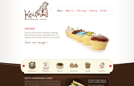
I like the header design, the logo with the navigation being placed in what looks like a speech bubble. Then the largely white background being broken up by a large horizontal section, really stands out strong. I like the sub navigation design too, the mouse over state is really bold. Interesting use of the QR code on the contact page too.


0 Comments