
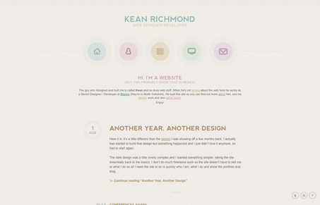
Interesting color palette on this website. The pastels are kind of unique from what I normally see being submitted here at UMS. I like the nice clean, heavy text feel to the design and the icons are nice looking too. I particularly like the site most as you scroll down towards the footer, the big circles holding the design samples and the smaller circles of the avatar’s of his friends is a nice visual draw for your eye as you scroll to the end there.




0 Comments