
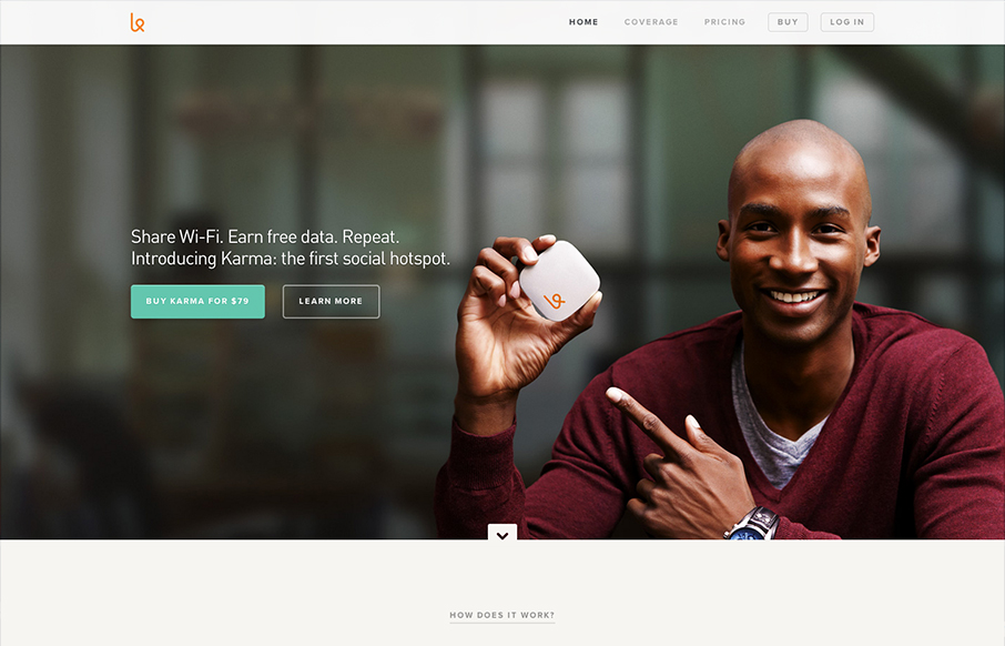
First off the design is gorgeous. The colors, typography and overall gestalt of the various elements make the design feel very welcoming and open. What I like most is the basic narrative, of “how does it work”, “how do I use it”, etc… I years past i’ve seen this type of “who, what, when, why, how” style of navigation built out as main nav elements, now on this design and others (which this is just a good example) it’s part of the narrative of the home page. Delivered witha solid layout and beautiful supporting graphics and photography. Well played and used, I love this kind of stuff.


Fitts’s Law: Why the Easy Button Wins
Large, close targets are faster to hit than small, distant ones, that’s Fitts’s Law. A look at the 1954 rule behind buttons, prime and magic pixels, thumb zones, and dark patterns.


0 Comments