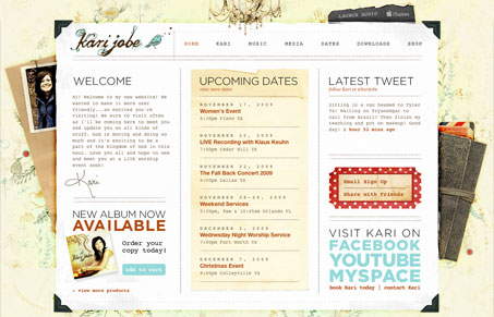
I love the texture and subtle color in this design. There is a ton of nice detail work and completeness to this design. I’m not wild about the main font chosen for all the copy, but I love the way the headlines are treated. They’ve now put up a splash page before this lovely site, I understand the strategic importance of that, but I’m not a fan of splash pages. The one thing I love is that they don’t immediately blast you with music on this site, they let me have the option to turn it on, that’s just smart and kind.
Looking Fast: The Art of Website Speed Perception
In the web world, technical speed and user perception matter. By improving design for a faster appearance, you boost conversions and stand out online. Speed isn’t just loading time; it’s perception.


0 Comments