
Submitted by: Harrison Weber
Jux is the best showcase for your content. It’s great for blogging, portfolios, events, travel and whatever you’re thinking right now. Full-screen and immersive, with no columns or blogrolls. Your pictures and words fill the page edge-to-edge: memorable, beautiful, distraction-free.
This is very unique design from a sign up UX perspective. They’ve placed the main call to action “sign up” botton directly under the logo, which is in a big blue speech bubble looking shape, and set it as a fixed element on the page. It’s very graphically different from the other images on the page that link you off to sample image galleries, plus it’s fixed in place. When you mouse over it everything get’s darker except the call to action shape/button which changes color. Brilliantly done.
Sign Up Form
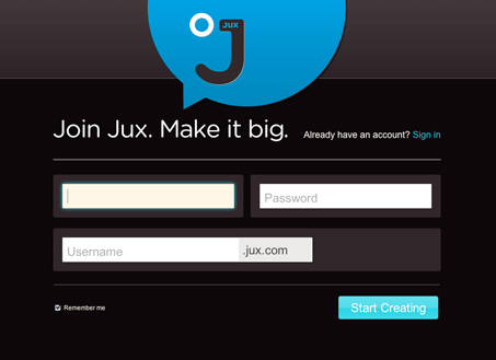
The sign up form is also well done. It’s simple, 3 fields. It has really nicely done microcopy in the headline “Join Jux. Make it big.” The submit button’s text is “start creating” which is great because it tells you what you’re going to do next. Finally I love the username field, it visually shows you how the subdomain username.jux.com is going to work as you simply look at the form field. Then as you use it there is an “available” or “unavailable” image that displays as you complete the form field.
The signup experience on this site is really well done and unique and well worth a look when you get a chance.


Thanks for posting about us! Take a took at our user pages to see what else we’re working on, and let us know what you think!
For example… http://www.jux.com/surround/global/users/'rockandpearl'/wd_quarks
They’ve got some nice error message details for incomplete fields. Also a helpful little 404 page.