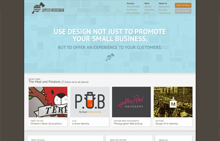
Jupiter Woodsman is a small design studio in Portland. I really like what they had to say about themselves in their background section
Since our methodology for design requires a lot of research and discovery, we tried to make the site an open book. We explain details about projects, processes and all the inner workings of Jupiter Woodsman.
This is refreshing and reassuring when companies are confident enough in their work and how they work to just put it all out there. And from a design standpoint, the site has a really nice feel to it. I dig the small, almost microscopic patterns behind the logo and above the ‘Meat and Potatoes’.
There is one major stumbling block for me however, and it has to do with the opening copy. I tried to read it, and for the life of me I couldn’t really get what it meant and I wanted it to just be clear and to the point but it just stopped me in my tracks. “Use design not just to promote your small business, but to offer an experience to your customers.” I think it’s probably best to avoid negatives in statements like this. The word ‘not’, even though it’s serving the same purpose as something like ‘in addition to’, makes the line awkward and hard to scan. Above all, be positive. And secondly, the sentence says nothing about what they do. So I can offer an experience to my customers with design? Well I guess I can go find somebody to do that. Gosh, I know this seems nitpicky to dwell on this, but if you’re going to have the most prominent element on your home page be a sentence, it better be a damn good sentence.
And it’s a shame because they do such great work! I love their illustration style, they have a nice blog and really seem like a fun little company. And otherwise the site is really nice. It has a nice hierarchy and it’s easy to navigate around. So all in all it’s a good site, really…


Jay-
Thanks again for the feature!
More than that, though, we really appreciate the feedback. It is more than easy enough to find loads of websites featuring inspiring design. Most of these sites just feature design on initial looks alone and don’t spend anytime looking at actually content or purpose. We find that you folks are great because you combine good looks with good thoughts. This way of thinking is really how we try to approach our own design tasks, and we appreciate the feedback that goes into your features. (Whether positive or negative!) It is nice that you noticed not just some of our design elements, but our ethos as well.
As for your comments on our opening copy, you bring forward a really good point. We intended to use this space as a periodically changing banner that is supposed to inject new life in the homepage when it changes every few months/weeks.
Your feedback has brought to light that the current banner’s vague message, that is more reminiscent of a general poster tagline than a call to potential customers, fails to meet the value needed of such a prominent element. It is clear that the current banner has overstayed its welcome, and new banner is on its way.
Thanks,
Kristen
Jupiter Woodsman Creative
Hey Kristen,
Thanks for the feedback on us! I hope you keep coming back to visit. I actually thought that you might have intended to make that banner rotate. I even refreshed a few times to try to make it happen. At any rate, we try to be constructive while pointing out the good. Please let us know when you have new stuff!