joyent.com

joyentcom

Joyent’s site is minimal and fresh. The limited use of color and perfectly laid out type really make successful. I can’t imagine the type being chosen and laid out any better. It’s plain old Lucida Grande, but there’s something about it that just fits this site. The spacing and font sizes strike a real balance that is easy to read. Even though this site is minimal, the gray area that goes off to the right creates a nice balance and allows the content on the left to come to the forefront. I am a little concerned that the content in that gray area may be subject to a little bit of ad-blindness, but since it’s secondary content maybe that’s not a bad thing.
joyentcss

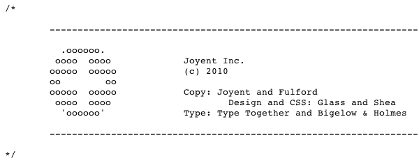
Cool CSS ASCII art for their logo.

We also discussed Joyent in Episode 40 of our podcast.

0 Comments

Submit a Comment

Your email address will not be published. Required fields are marked *

News & Articles

Sign-Up: Enhancing Conversions through good UX

Sign-Up: Enhancing Conversions through good UX

Optimize your website’s sign-up process by focusing on clarity, ease, and user mindset. Clearly explain the purpose, benefits, and steps, and use social proof to build trust and drive conversions.

The Essential Guide to Getting Started on Freelance Writing

The Essential Guide to Getting Started on Freelance Writing

Explore the lucrative and fulfilling world of freelance writing with our essential guide. Learn about specialties like blogging, social media, article, and technical writing. Build a portfolio, find work, set up your business, and discover the potential earnings. Embrace the freedom of working from home and follow tips for success in your dream career.