johnnydoes.nl

johnnydoesnl

Submitted by @johnny_does, Designer.

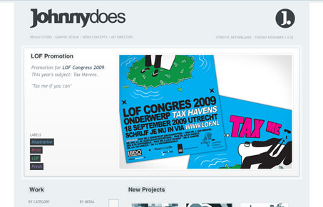
With minimal design a very clear and strong portfolio showroom. No distracting elements and focus on the artwork. Besides that the user is served with multiple entrees of aspects of the artwork. The choice can be made on base of interest.

I really like the separation of the elements on the home page of this website. The large work images placed above the tighter groupings of sectional info works really well. The small interactions, going from B&W to color images is a nice subtle touch.

0 Comments

Submit a Comment

Your email address will not be published. Required fields are marked *

News & Articles

Looking Fast: The Art of Website Speed Perception

Looking Fast: The Art of Website Speed Perception

In the web world, technical speed and user perception matter. By improving design for a faster appearance, you boost conversions and stand out online. Speed isn’t just loading time; it’s perception.

Designing for Errors: Creating User-Friendly Contingency Plans

Designing for Errors: Creating User-Friendly Contingency Plans

Contingency Design hinges on empathy, understanding user frustration, and transforming errors into positive impressions. By embracing these principles, you enhance user experiences, retain customers, and boost revenue in the competitive digital landscap