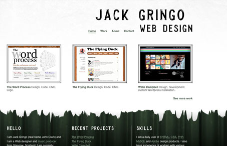
Really an absurdly simple website, but that’s what makes is work for me. No fancy stuff, just presented work. I also like how all the weight is put on the footer area instead of the header. It’s a nice divergence from the standard style of giant headline and lightboxed samples.
Glassmorphism: The Transparent Design Trend That Refuses to Fade
Glassmorphism brings transparency, depth, and light back into modern UI. Learn how this “frosted glass” design trend enhances hierarchy, focus, and atmosphere, plus how to implement it in CSS responsibly.


0 Comments