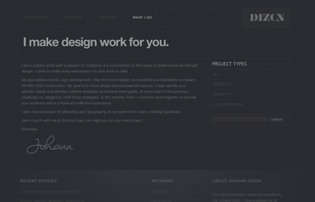
This is a really interesting looking website. The dark color, and all the design elements in a single line style. It looks like some sort of blueprint. Just lots of subtle work, like the right-side navigation roll-over effect. It’s nice.
Glassmorphism: The Transparent Design Trend That Refuses to Fade
Glassmorphism brings transparency, depth, and light back into modern UI. Learn how this “frosted glass” design trend enhances hierarchy, focus, and atmosphere, plus how to implement it in CSS responsibly.


I’ve just gone blind reading this site. The gray text on the dark background destroyed my vision. Bummer… 🙂