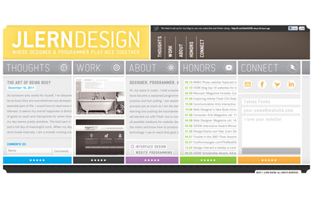
Jlern.com is an interesting experiment in interface design. The structure is pretty much like Chris Coyier’s infogrid. Each ‘page’ is one leaf of a flexible accordion that expands when clicked. In theory, its a pretty cool idea. When you get down to it, having pages on a site is just a way of organizing information and only revealing relevant content. It gives you control over how the user consumes information and in what order. jlern.com does essentially the same thing, its just on one page. I can’t for the life of me understand why the content areas are so small or why they don’t take advantage of the entire width of the browser but its an interesting idea. One detail that is very nice is the solid border that wraps around the perimeter of the site. Its a detail that you don’t see very often and the separation that it creates from the browser chrome is very appealing.
The site has a self-contained, app-like feel that I find appealing. I don’t quite understand the distribution of screen real estate but is nice non-the-less.


Great concept, however it looks as though more experimenting to get the right idea out is needed.