I love the rich bold colors of this design. The large imagery and simple single page nature of this site are great. I really like how the logo has some kind of radiant glow back behind the shape of the site’s container. It really serves as a great launch pad for the firms recent project and then as you scroll introducing you to the team.
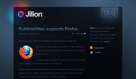
The blog is also really nice, mirroring the design of the main site, it’s really well done simplicity. One thing that makes the blog work a bit better than the main page is the left only justification, I’d really like to see that on the main page of the site. That’s just me, justified type of a website makes the copy harder to read because the word spacing isn’t natural feeling, imho.

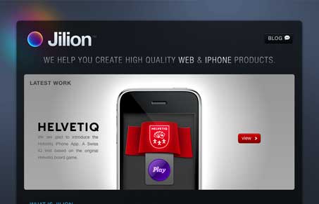



Very nice design to look at, but must agree on the note about the justified text – horrible word spacing! Justified text should never be used unless text is hyphenated which can be a bit tricky in web design, or the at least only of the lengths of the lines are great enough to even out the spacing more.
love the logo glow