
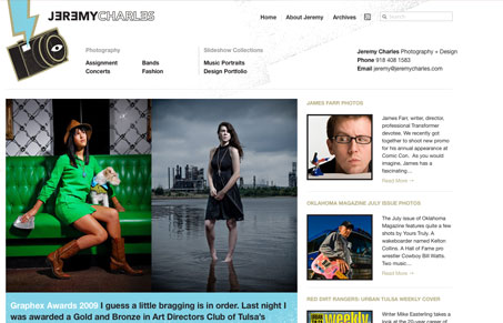
I like the vertical rhythm of this site, it seems “large” in it’s scale but it just flows really well to me. The large feature photo with the smaller thumbnails in the second column just works really well. Then the footer with the diagonal line really brings focus to the latest projects. Good looking layout here.


Fitts’s Law: Why the Easy Button Wins
Large, close targets are faster to hit than small, distant ones, that’s Fitts’s Law. A look at the 1954 rule behind buttons, prime and magic pixels, thumb zones, and dark patterns.


0 Comments